
MeshMonitor Theme Gallery
MeshMonitor offers 15 carefully crafted themes to suit every preference and accessibility need.
Catppuccin Themes
The classic Catppuccin palette in four beautiful variants:
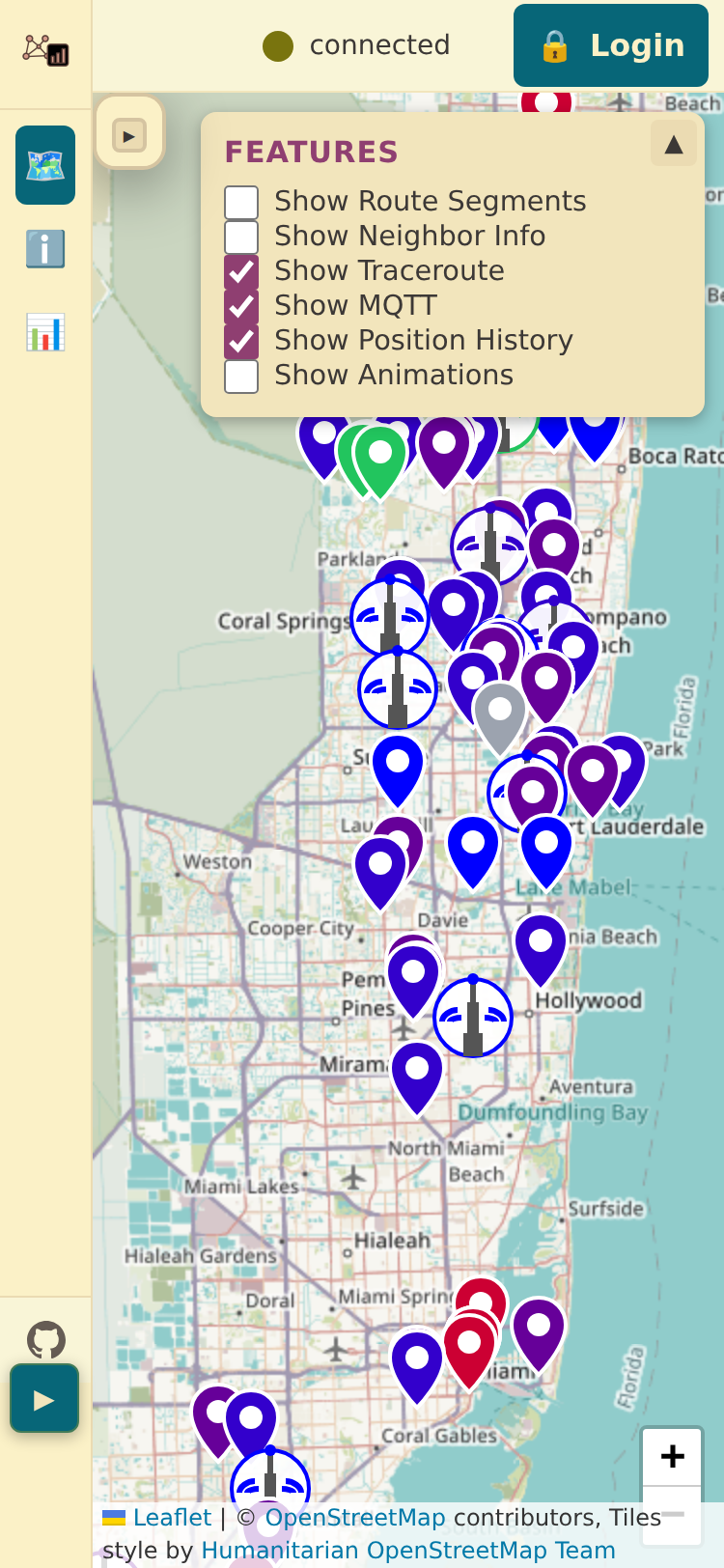
Latte (Light)
- Description: Soothing pastel light theme
- Best for: Daytime use, outdoor viewing
- Colors: Warm pastels on light backgrounds
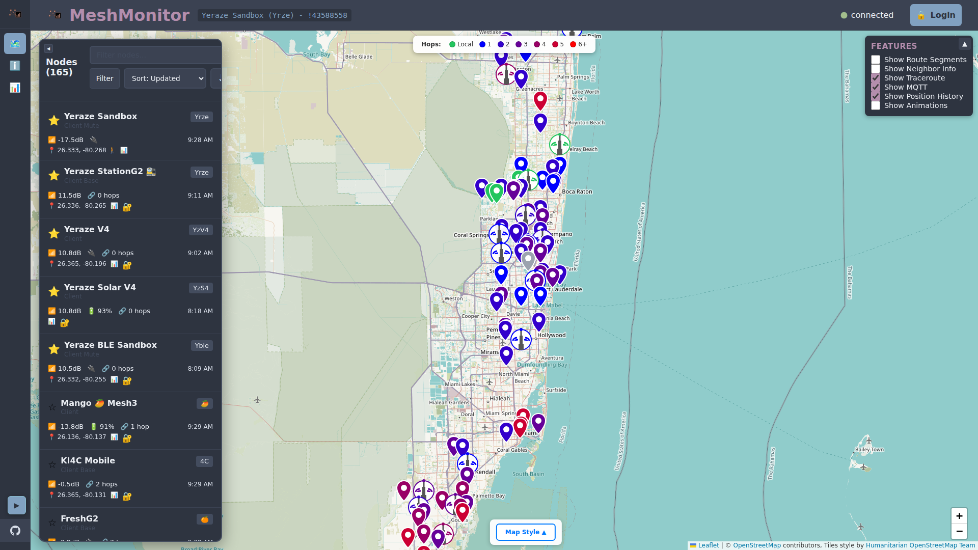
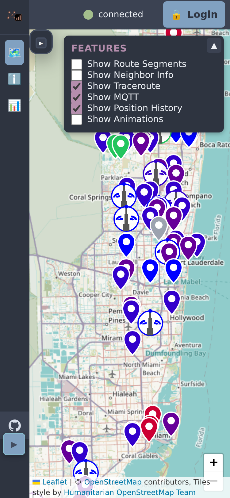
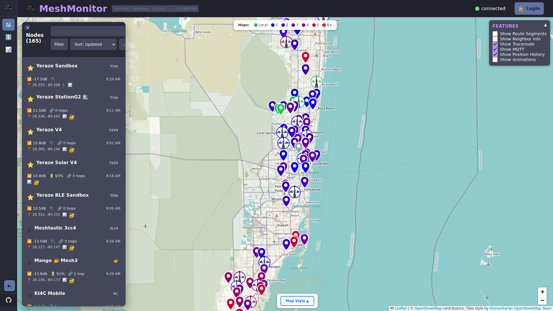
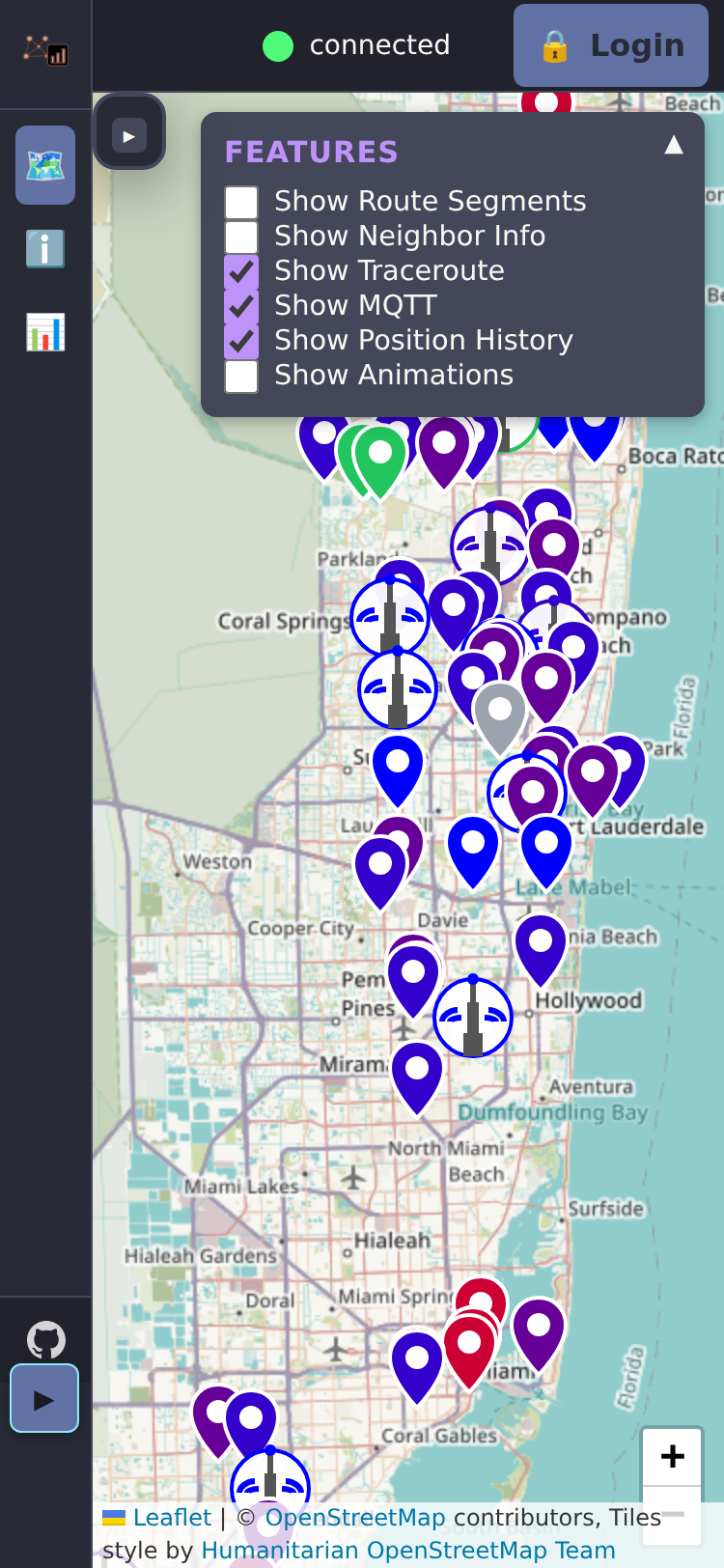
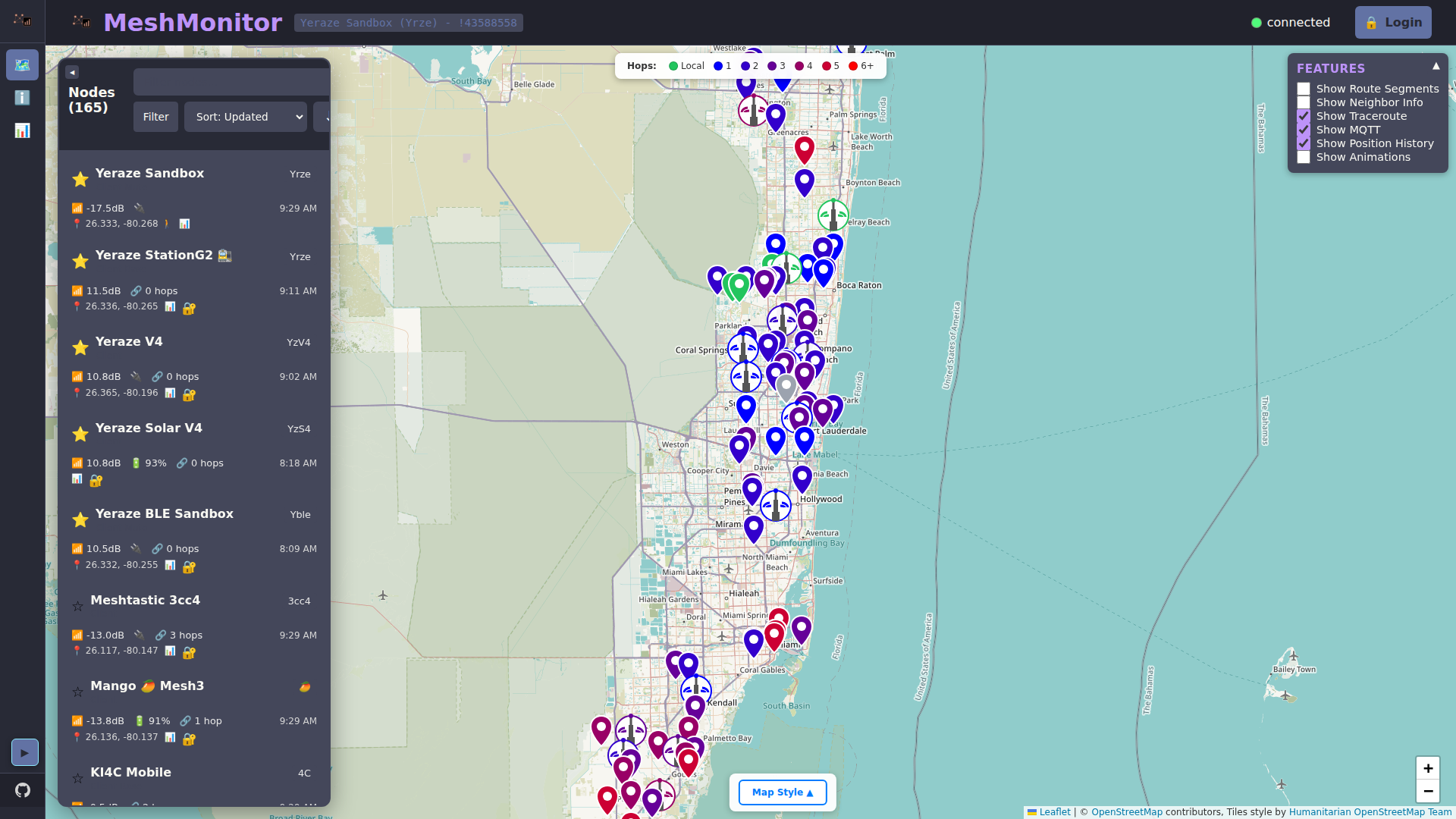
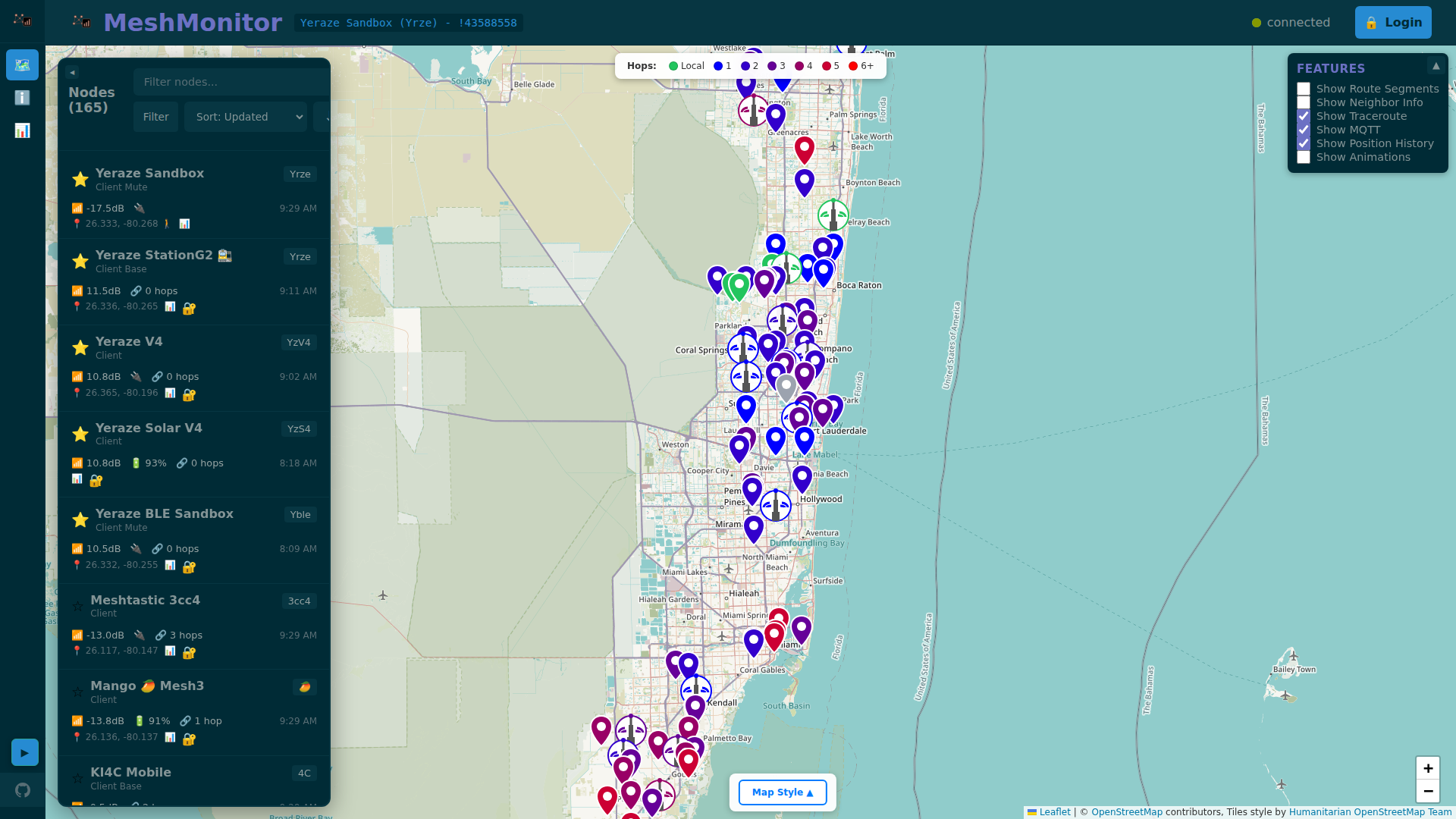
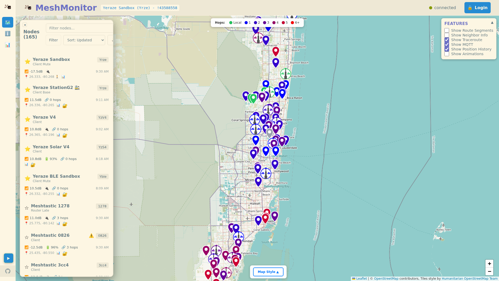
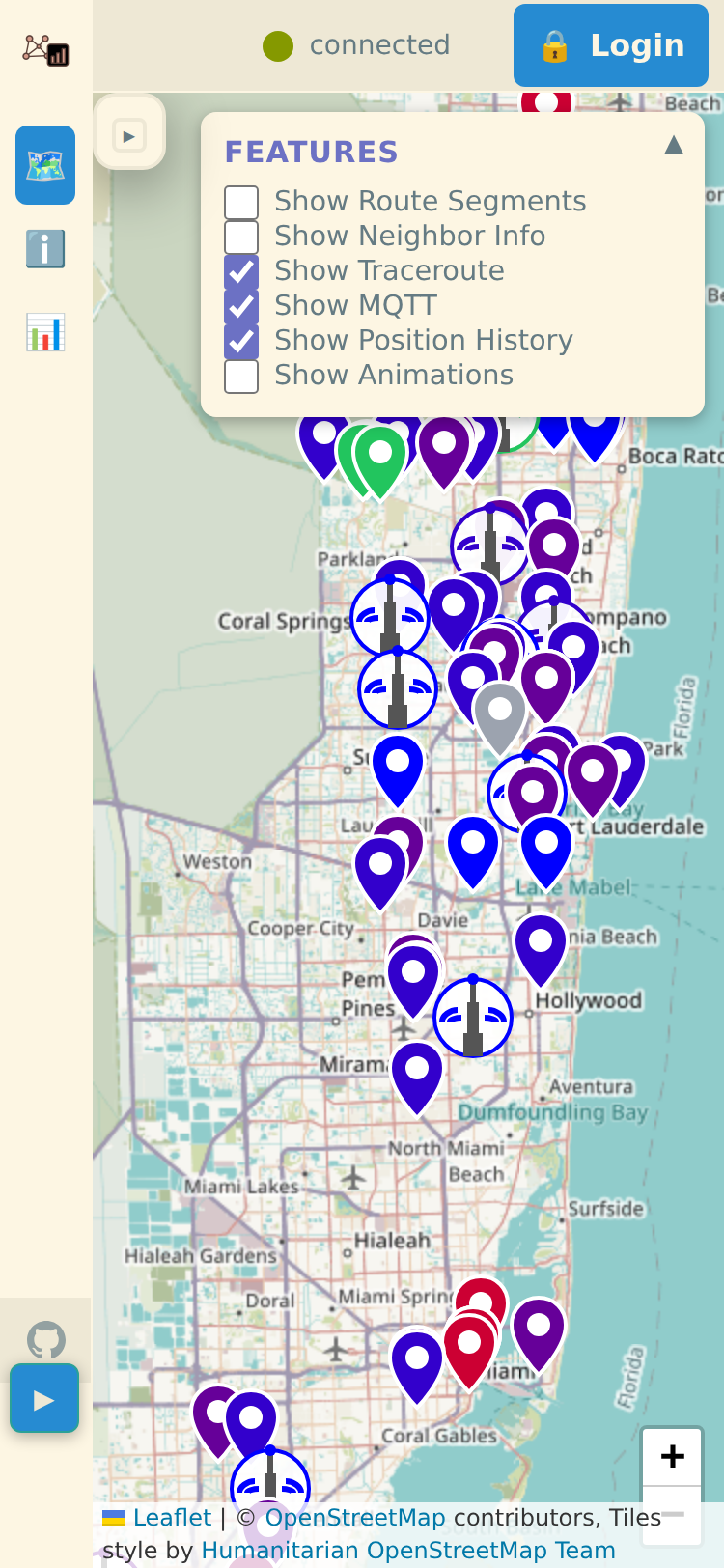
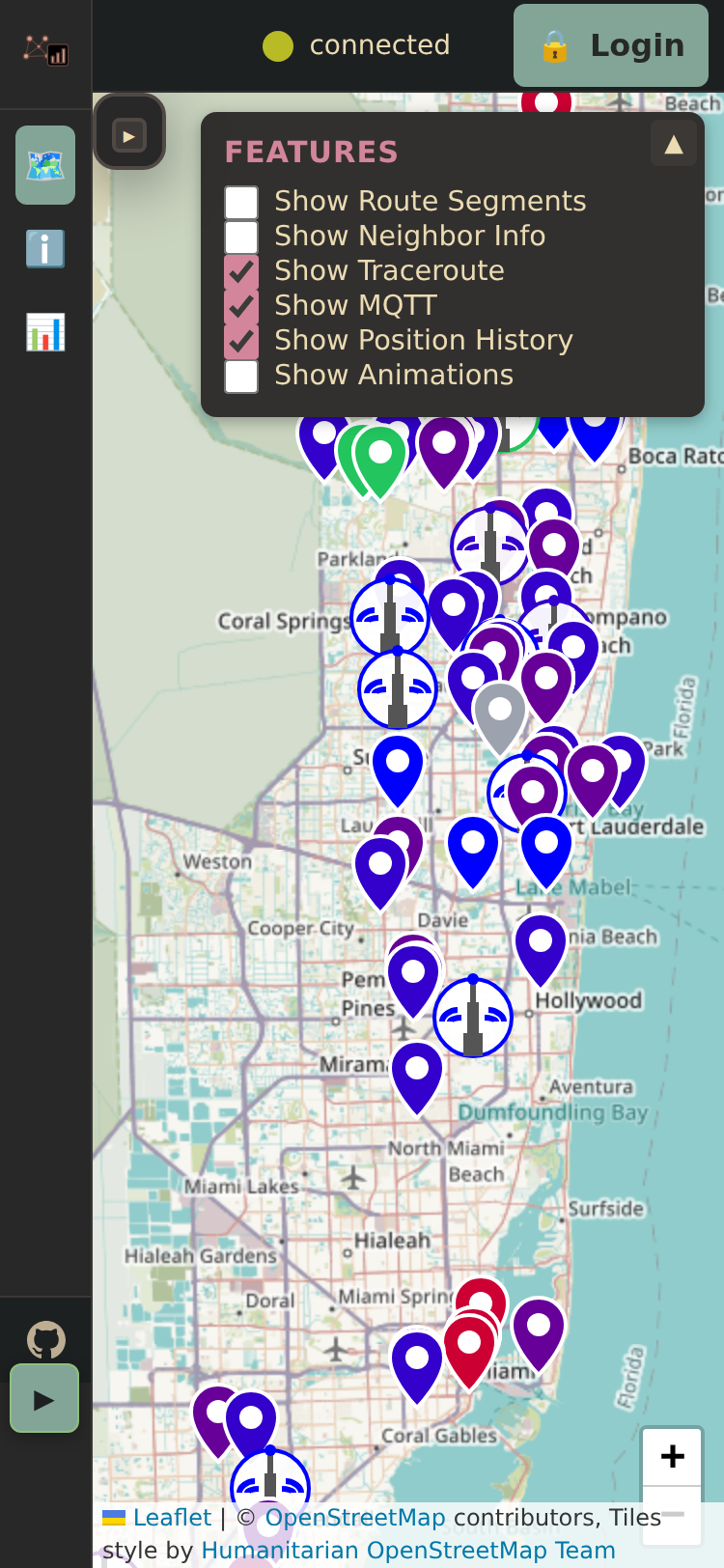
Nodes View

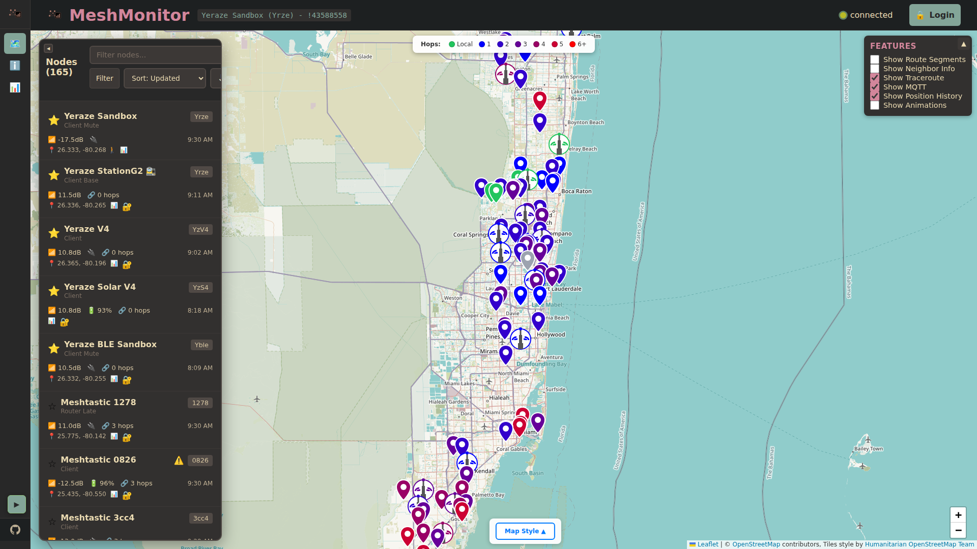
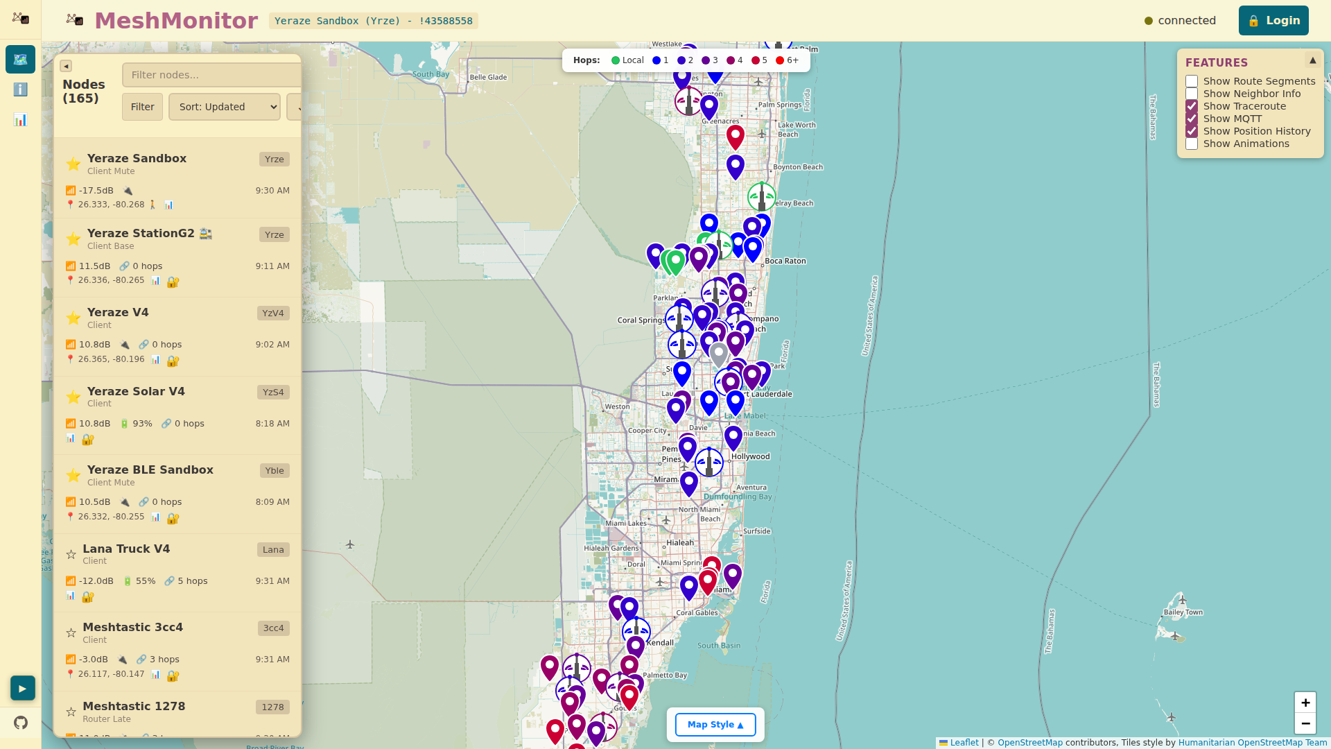
Channels View

Frappé (Medium)
- Description: Medium-contrast cool theme
- Best for: Reduced eye strain in normal lighting
- Colors: Balanced mid-tones
Nodes View

Channels View


Macchiato (Medium-Dark)
- Description: Medium-dark comfortable theme
- Best for: Extended viewing sessions
- Colors: Comfortable dark palette
Nodes View

Channels View

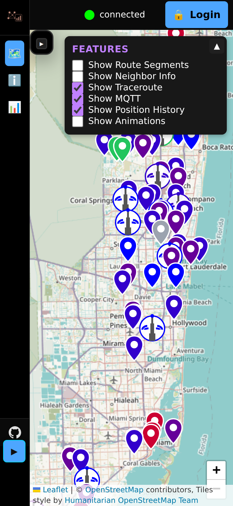
Mocha (Dark) - Default
- Description: Deep dark theme
- Best for: Low-light environments, OLED displays
- Colors: Rich dark backgrounds with vibrant accents
Nodes View

Channels View
Popular Themes
Nord
- Description: Arctic, north-bluish color palette
- Best for: Clean, professional appearance
- Colors: Cool blues and grays
- Origin: Inspired by the Arctic
Nodes View
Channels View


Dracula
- Description: Dark theme with vibrant purple and pink accents
- Best for: Users who love bold colors
- Colors: Deep purples, bright pinks, vibrant accents
- Origin: One of the most popular dark themes
Nodes View
Channels View

Solarized Dark
- Description: Precision colors for machines and people
- Best for: Professional environments, coding
- Colors: Scientifically-balanced earth tones
- Origin: Ethan Schoonover's classic theme
Nodes View


Channels View
Solarized Light
- Description: Light variant of the classic Solarized theme
- Best for: Bright environments, print-friendly
- Colors: Warm light backgrounds with earth-tone accents
- Origin: Ethan Schoonover's classic theme
Nodes View


Channels View
Gruvbox Dark
- Description: Retro groove color scheme with warm tones
- Best for: Vintage aesthetic lovers
- Colors: Warm retro palette
- Origin: Inspired by vintage terminals
Nodes View


Channels View
Gruvbox Light
- Description: Light variant of the warm Gruvbox theme
- Best for: Warm, comfortable daytime viewing
- Colors: Warm light backgrounds with retro accents
- Origin: Inspired by vintage terminals
Nodes View


Channels View
High Contrast Themes (WCAG AAA Compliant)
High Contrast Dark
- Description: Maximum contrast for improved readability in dark mode
- Best for: Users with low vision, high ambient light
- Accessibility: WCAG AAA compliant
- Colors: Pure blacks and whites with vibrant accents
- Contrast Ratio: Exceeds 7:1 for all text
Nodes View

Channels View

High Contrast Light
- Description: Maximum contrast for improved readability in light mode
- Best for: Users with low vision, bright environments
- Accessibility: WCAG AAA compliant
- Colors: Pure whites and blacks with strong accents
- Contrast Ratio: Exceeds 7:1 for all text
Nodes View
Channels View


Color Blind Friendly Themes
Protanopia (Red-Blind Friendly)
- Description: Optimized for red color blindness
- Accessibility: Designed for protanopia - affects ~1% of males
- Colors: Uses blue/yellow contrast instead of red/green
- Best for: Users with red color blindness
Nodes View


Channels View


Deuteranopia (Green-Blind Friendly)
- Description: Optimized for green color blindness
- Accessibility: Designed for deuteranopia - affects ~1% of males
- Colors: Uses blue/yellow contrast instead of red/green
- Best for: Users with green color blindness
Nodes View


Channels View
Tritanopia (Blue-Blind Friendly)
- Description: Optimized for blue color blindness
- Accessibility: Designed for tritanopia - rare, affects ~0.001%
- Colors: Uses red/cyan contrast instead of blue/yellow
- Best for: Users with blue color blindness
Nodes View
Channels View


How to Change Themes
- Navigate to Settings in the sidebar
- Scroll to the Display Preferences section
- Find the Color Theme dropdown
- Select your preferred theme from the organized categories:
- Catppuccin (4 themes)
- Popular Themes (6 themes)
- High Contrast (2 themes - WCAG AAA)
- Color Blind Friendly (3 themes)
- Your choice is saved automatically and persists across sessions
Accessibility Features
- WCAG AAA Compliance: High Contrast themes meet the highest accessibility standards
- Color Blind Support: Three specialized themes for different types of color blindness
- Persistent Choice: Your theme selection is saved and applies across all pages
- Instant Switching: Themes update immediately without page reload
- System-Wide: All UI elements respect the selected theme
Theme Persistence
Your theme choice is stored locally and synchronized with the server, ensuring:
- Consistent appearance across devices
- Persistence across browser sessions
- No loss of preference on cache clear (server backup)
- Immediate application on login
Technical Details
All themes use CSS custom properties (CSS variables) for dynamic switching. Each theme defines:
- Base colors (background, surfaces)
- Text colors (primary, secondary, tertiary)
- Accent colors (blue, green, yellow, red, purple, pink)
- Semantic colors (success, warning, error, info)
This ensures consistent theming across all components including:
- Sidebar and navigation
- Message containers and chat
- Telemetry graphs and charts
- Node information displays
- Settings and configuration panels
- Modals and popups
Contributing
Have a theme suggestion? Open an issue on our GitHub repository with:
- Theme name and description
- Color palette (hex values)
- Use case or target audience
- Any accessibility considerations
We're always looking to expand our theme collection!